

Below are steps and techniques for how to analyze IELTS Pie Charts for Task 1 Writing questions for the Academic IELTS test. Also, you will learn how to use your analysis of pie charts to write an effective Task 1 Writing response.
Creating an IELTS Writing Task 1 response analyzing Pie Charts
Remember, for the IELTS Academic Writing Task 1 question, you need to analyze a chart, table, diagram, map, or graph (or a combination of these). The Academic Writing Task 1 assignment is always the same: “Summarize the information by selecting and reporting the main features and make comparisons where relevant.”
Let’s use the following sample question to see how we can analyze IELTS Task 1 pie charts to build an effective Task 1 response.
Before we begin writing your IELTS Task 1 response, we need to spend a few minutes analyzing the pie charts and planning what we will write. During this analysis we want to ask a few questions:
What seems most important to know about each purchase method?
Which purchase methods show a similar pattern of increases or decreases?
Which purchase methods show an opposite (or ‘inverse’) pattern of increases or decreases?
Is there a purchase method which is consistently highest or lowest?
Is there one or two ideas that summarize most or all of the chart, even if it is in a vague way?
Step 1: Analyzing each purchase method for a Main Feature
First, when you analyze IELTS pie charts you need to look at each purchase method, one by one, and notice how the percentages change over the three charts. Start with 2005, then move to 2010, and finally look at 2015.
What trends or patterns do you see?
Do the percentages continually increase?
If so, do they increase dramatically or only a little?
For example, when analyzing these three pie charts, you might notice the following:
- Supermarket purchases fluctuated only a little over the ten years.
- Department store purchases fluctuated dramatically over the ten years.
- Specialty/retail store purchases gradually decreased over the ten years.
- Drug store purchases dramatically decreased over the ten years.
- Party and home show purchases did not change over the ten years.
- Online purchases dramatically increased over the ten years.
We should now be able to use these pieces of information as Main Features for each of the purchase methods.
Step 2: Comparing Main Features to each other
Next, however, we need to compare these purchase methods to each other. These comparisons will help us to create a plan for our body paragraphs.
Are there two or three purchase methods that show similar trends? If so, is there anything that makes them different from each other?
Are there two or three purchase methods whose trends go in opposite directions? Does one purchase method continually increase while the other is continually decreasing?
Is there a purchase method that shows a trend unlike any other purchase method?
For example, when comparing these three pie charts, you may notice the following:
- Online purchases dramatically increased. In fact, looking at the numbers, online purchases quadrupled every 5 years.
- In contrast, drug store purchases dramatically decreased.
- While Specialty/retail store purchases decreased too, they did so more gradually over the ten years.
These three purchase methods could form the basic outline of one body paragraph.
For the remaining purchase methods, you may notice the following comparisons:
- Department store purchases fluctuated dramatically over the ten years.
- Supermarket purchases fluctuated only a little over the ten years.
These two purchase methods could form the basic outline of another body paragraph.
Lastly, one purchases method follows a trend completely different from any other:
- Party and home show purchases did not change over the ten years.
We can now use these groupings to build an outline for our body paragraphs (paragraphs #2 and #3). Because these pie charts are simple, we only need to write a three-paragraph response.
Step 3: Choosing information for the Overview statement
Now we have to think about what information should go in our Overview statement. Remember, an ‘Overview Statement’ states what we think is most important to know about all three pie charts.
Is there something true about all three years?
Is there something true about most (but not all) of the purchase methods?
If there was only one piece of information you could give about the pie charts, what would that be?
For example, when we analyze IELTS pie charts here, a few things seem clear:
- Department store purchases always had the highest percentage of sales.
- Online purchases are quickly increasing to almost be equal to department store purchases.
- Five out of the six purchase methods experienced various degrees of fluctuations in their share of total sales.
Of these three pieces of information, the last one describes almost all of the purchase methods, so that would be good to include in our Overview when we analyze IELTS pie charts. Also, the information about department stores seems like it would be good include in our Overview, because it focuses on what was consistently the top-ranked purchase method.
NOTE: In Overview Statements for graphs, charts, or tables, it can often be useful to focus on the the ‘rankings’ (highest, lowest, etc.) of different parts of a graph, chart, or table. This is especially true when you are having a hard time deciding what information feels ‘most important’!
Step 4: Writing the Overview Paragraph
Now we need to start writing our response. First, we need to write the first paragraph: the ‘Overview Paragraph’. In this paragraph we only need to include two items: 1) paraphrase of the Description Sentence and 2) an Overview Statement.
Paraphrasing the Description Sentence
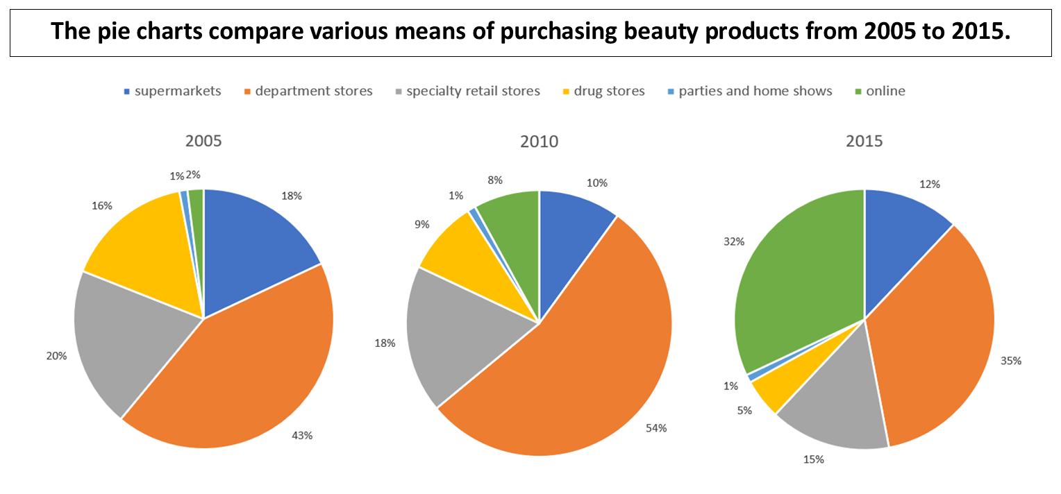
The Description Sentence is the one-sentence description given to you above the pie charts: “The pie charts compare various means of purchasing beauty products from 2005 to 2015.” We need to rephrase this using as much of our own grammar and vocabulary as possible, as well as get a little more specific about what kind of information is in the pie charts.
For example, this might be a good paraphrase of the Description Sentence:
The pie charts compare six different methods in which beauty products are purchased over a ten-year time period.
Notice that our paraphrase gets a little more specific about what information is in the pie charts. Our paraphrase mentions that there are “six different methods”, which was not in the original Description Sentence.
Creating the Overview Sentence
Then, we will write our Overview Statement. For all your Overview Statements, we recommend you always start with “Overall, it is notable that…”.
For example, this might be a good paraphrase of the Description Sentence:
Overall, it is notable that while several of these fluctuate wildly between 2005 and 2015, buying beauty products at department stores remains the most popular, with online purchasing dramatically growing.
In this sentence, we have included all three pieces of information in a complex sentence with a lot of high-level grammatical structures and a few high-level vocabulary words.
So, with those two sentences, I have now completed my Overview Paragraph. This paragraph is 48 words long!
The pie charts compare six different methods in which beauty products are purchased over a ten-year time period. Overall, it is notable that while several of these fluctuate wildly between 2005 and 2015, buying beauty products at department stores remains the most popular, with online purchasing dramatically growing.
Step 5: Writing Paragraphs #2 and #3 (and possibly #4)
Now I need to write two body paragraphs where I describe the Main Features I came up with earlier. Also, I will need to add some statistics (i.e., numbers) that ‘support’ some of these Main Features. Typically, I will add statistics to most, but not all, of the sentences in my body paragraphs.
In my analysis, I already grouped some of the different purchasing methods, which I will use to build my body paragraphs:
-
- I’ll focus on online, drug store, and specialty/retail store purchases in Paragraph #2.
- I’ll focus on department store and supermarket purchases in Paragraph #3.
- I can add a sentence about party and home show purchases in either Paragraph #2 or #3 (whichever paragraph is shorter).
Using words and phrases to introduce, connect, and contrast
When writing my body paragraphs, it is very important to use words and phrases that introduce, connect, and contrast these different purchase methods. Words and phrases like “according to…”, “however”, “similarly”, and “regarding” are very useful to do this.
Adding statistics to provide “evidence” for Main Features
The last thing I need to think about with what statistics (i.e., numbers) I will add to my response. For the most effective, high-level responses, we need to provide ‘evidence’ that various purchase methods are increasing or decreasing. So, in most of the sentences in paragraph #2 and #3, I will add short prepositional phrases in various ways. Sometimes I will add them to the end of a sentence and sometimes I will add them somewhere in the middle.
See how I use various words and phrases to introduce, connect, and contrast the different pieces of information in these following paragraphs. Also, notice also how I add statistics to support most of the Main Features in each sentence.
According to the charts, purchasing beauty products online experiences the most dramatic change between 2005 and 2015, quadrupling its percentage every five years, going from 2% to 8% and then to 32% in 2005, 2010, and 2015, respectively. As online purchasing increased, however, drug store purchases saw an inverse trend, starting at 16% in 2005 but plummeting to just 5% by 2015; specialty store sales fell as well, but less dramatically than those for drug stores.
Only one purchase method saw both significant rises and falls in its percentages; department stores, which were 43% of all purchases in 2005, jumped to 54% in 2010 before falling to 35% in 2015. In comparison, supermarket purchases did witness a sharp decrease between 2005 and 2010 but then stabilized between 2010 and 2015. Interestingly, the percentage of products bought at parties or home shows remained flat at only 1% throughout the decade.
You can find more information about how to use transition words and statistics in our Top 5 IELTS Academic Task One Writing Tips blog post! Also, study the sample responses found on our Sample IELTS Writing Task 1 Charts & Responses blog post!
Complete Response for IELTS Writing Task 1 Pie Charts
And that’s it! For IELTS Writing Task 1, we do NOT need a conclusion paragraph. Again, some IELTS Writing Task 1 responses may require a fourth paragraph because you are analyzing more complex pie charts.
See the complete response for this IELTS Academic Writing Task 1 Pie Charts Question
Summary
So, you need to practice how to analyze IELTS Pie Charts and see what parts of the sample response above you can use for other Task 1 responses. Many parts of the above response could be used for Task 1 questions focused on graphs, tables, bar charts, maps, and diagrams, too! The more you practice writing Academic IELTS Task 1 responses, the more you will see your IELTS Writing score improve!
More IELTS Writing Tips!
- Top 5 IELTS Academic Task 1 Writing Tips
- Top 5 Tips to improve Writing IELTS Academic Task 1 Skills
- Advanced Grammar for IELTS Writing Task 1
- Advanced English Vocabulary for IELTS Academic Writing Task 1
- Prepositions about Time for IELTS Academic Writing Task 1
Want to know how to prepare for the IELTS exam at home? You can learn many IELTS preparation tips for how to improve your IELTS score with PELA Online’s Academic IELTS Preparation course, with Modules to help you with listening, reading, writing, and speaking test questions.
Watch Lesson 1, Module 1 for IELTS Writing Task One for FREE!
Want to learn more IELTS Writing tips? Learn how to start paragraphs for IELTS Task 1 Writing!
Be sure to subscribe to PELA on Facebook, YouTube, Instagram!